With the new year comes new standards, especially for mobile-first web design. As time progresses, more people are browsing the web on their phones, which means we as web developers need to find efficient and eye-catching ways to pull and keep the readers’ attention.
What is mobile-first design?
Browserstack.com states, “Mobile-first design or Mobile-first approach enables web designers to start product design for mobile devices first. This can be done by sketching or prototyping the web app’s design for the smallest screen first and gradually working up to larger screen sizes.”
Why Does Mobile Matter in 2026

In the present day, it is more likely for someone to browse the internet on a mobile device than on a computer, for example, social media, checking their email, online shopping, etc. Which means it is starting to become essential for us as developers to make our websites mobile-friendly.
Implementing mobile responsiveness will also help you score higher in the search results. Search engines prioritize mobile friendliness, performance, and core web vitals. This means that making your website more mobile-friendly could boost your SEO score.
Content First Then Layout
When designing for mobile, you have to be brutally honest about what is a must and what is optional. For example, you should choose a CTA over an unrelated image. Essentially, what I’m trying to say is that Critical features and content should come before non-essential ones.
Let the content dictate breakpoints, not device lists.
What is a device list approach? A device list approach involves adding breakpoints at specific screen sizes (375, 768, 1024, 1440), even if the layout is already broken or if it is completely fine before those sizes. It is best to use a content-based approach, which means you will add breakpoints when the website stops looking good or the layout breaks.
Mobile Users Don’t Have Mice!
Imagine you’re a user and you go to a website on your phone to find a cluster of buttons and links, and when you try to click one of those buttons or links, it doesn’t go where you want to go because you accidentally clicked A completely different link. That could be a real hassle, especially when you just want a bit of information. Websites are supposed to be user-friendly, and when you have a design that doesn’t keep mobile users in mind, it could drive down the visits to your website. Also, USERS ARE LAZY they prefer not to be inconvenienced when navigating your site. Keep important buttons and links within thumb reach.
When designing for mobile, it is best to remember that users don’t use mice! To start, try to use simple nav bars (Hamburger, bottom nav, or sticky top bar) with scannable labels

To make navigation easier for users, make large, well-spaced tap targets and place primary actions (buttons and important links) within thumb reach on average phones. Keep the user’s attention while keeping their visit enjoyable and convenient
Keep the Design Fluid and Responsive
We all (hopefully) know how big a phone is, now imagine going on to a website just for it to look like this:
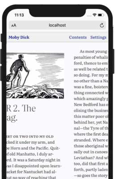
Now that doesn’t look very appealing, does it? When making a mobile-first design, try sticking to singular columns. This keeps the look of your website neat and organized, and users LOVE a neat and organized website.
Always make your CTAs stand out on your website. CTAs are supposed to be eye-catching and are supposed to pull the user’s attention, so make that CTA stand out! Make that CTA the center of attention.
Stay away from images that don’t provide context to the website and are there just for design purposes. Keep all content on mobile strictly related to the website. Long load times could lead to users clicking off the website, and as a user myself, I have left a website because it took too long to load.
Although I think they go hand in hand, Figma.com has a post detailing the differences between mobile-first and responsive design.
Let’s sum up our neat conversation
For all of my web developers who hate reading long blogs heres a summary of this post.
Key points:
- Mobile is now the primary way people use the web (social, email, shopping), so mobile-first design is essential, not optional.
- Search engines reward mobile responsiveness, performance, and good Core Web Vitals, so better mobile design can improve SEO rankings.
- Start with content, not layout: decide what is critical (like CTAs) and remove or de‑prioritize non-essential elements and decorative images.
- Use content-based breakpoints: add breakpoints when the layout actually breaks or looks bad, not just at fixed device widths like 375, 768, 1024, 1440.
- Remember mobile users do not have mice: avoid clusters of tiny links, use simple navigation (hamburger, bottom nav, or sticky top bar) with clear labels.
- Make tap targets large and well spaced, and place primary actions within comfortable thumb reach to reduce frustration and keep users on the site.
- Prefer single-column layouts on mobile to keep pages neat, organized, and easy to scan.
- Make CTAs visually prominent so they immediately attract attention and guide users to key actions.
- Avoid images that are only decorative and slow the site down; keep all mobile content relevant and lightweight to prevent long load times and user drop-off.
Done reading?
Check out some of my current projects